License to Kill Stupid Rules
VISUAL IDENTITY
Creative | Graphic Design | Branding | Visual Identity
The "License to Kill Stupid Rules" is a concept aimed at identifying and eliminating unnecessary or counterproductive policies within an organization. We have embarked on the creation of a visual identity system based on this concept, the objective of which is to serve as a starting point in case a company views favorably on promoting these practices.
Collaborator:
David Morales | Graphic Design
Avishkar Misra | Data Scientist
…it’s an exercise to help eliminate barriers that are holding us back from being more innovative.
Problem Statement
Many issues that seem like technical problems are often rooted in human or process-related challenges. That’s why identifying and addressing the root cause is essential to prevent the repeated cycle of failures, much like the approach used in "Kill a Stupid Rule." By adopting this strategy, organizations can foster a culture of agility and responsiveness, ultimately driving better performance and higher employee satisfaction.
Design Problem
Create a cohesive visual identity system that communicates the concept of identifying root causes and improving processes while eliminating counterproductive rules. Through the strategic use of iconography, typography, and color, design a set of visuals that not only simplify complex concepts but also engage and inspire action.

Overview
THE ORIGEN
The concept of "Killing Stupid Rules" is often attributed to Clayton Christensen, a renowned professor at Harvard Business School and author of The Innovator's Dilemma. In his work, he emphasizes the importance of challenging traditional practices and outdated rules that hinder innovation and progress.
THE PROPOSAL
The core idea is that businesses should identify and eliminate inefficient or restrictive rules that no longer serve their purpose. This allows companies to foster a more agile, creative, and efficient environment. By removing these "stupid rules," organizations can better adapt to change and drive innovation.
With the aim of supporting a possible advertising campaign, we have embarked on the creation of a visual identity system based on this concept, the objective of which is to serve as a starting point in case a company views favorably on promoting these practices.
THE SOLUTION
The visual identity project for KSR is a comprehensive design initiative aimed at creating a cohesive and impactful visual presence that aligns with the brand’s values, mission, and vision. This project seeks to define a distinct and consistent visual language across all touchpoints, ensuring that every interaction with the brand is memorable and meaningful.
The goal of the visual identity is to establish a strong, recognizable brand presence that resonates with the target audience and communicates the brand's core message. From logo design to color palettes, typography, and imagery, this visual identity system will serve as the foundation for both current and future brand applications, across all platforms.
Key elements of the project include:
Color Palette: Selecting a versatile and appealing color scheme that reflects the brand’s personality and works across various platforms.
Logo Design: Crafting a unique, timeless logo that encapsulates the essence of the brand.
Typography: Defining a set of fonts that are visually aligned with the brand and ensure readability and accessibility.
Imagery and Iconography: Establishing guidelines for photography, illustrations, and icons that convey the brand’s tone and messaging.
THE USAGE
This visual identity would be applied across a range of media, including digital platforms (websites, social media), print materials (brochures, business cards), and physical spaces (retail environments, packaging), ensuring that every touchpoint delivers a seamless, unified experience for all audiences.
DESIGN SYSTEM
1. Color palette
The primary palette, characterized by high contrast, is designed to support and enhance key brand and design elements.
2. Typography
Print / Digital usage (optional use)
KSR_Team uses three different fonts based on the project/campaign. Each font has different usage.
Bebas Neue. Is a sans serif font, very similar used in the 007 movie series. Used for Heading (H1) and Sub Subheading (H2). Suggested for Ads, Posters, banners and bold taglines.
Raleway. A secondary typeface that aims to support other level of messages on the communication pieces.
Arial. This is a typeface family with multiple variations. Only applicable when creating digital content with the Microsoft Sway app. Used for Heading (H1), Sub Subheading (H2) and Paragraph (p1).
3. Logo
The proposals are derived from the visual concept of agent 007, generated over the years.
A "007 agent" refers to a fictional secret agent from the James Bond series, created by author Ian Fleming. The "007" designation is the code number assigned to James Bond, a British MI6 spy known for his suave demeanor, impressive skills, and ability to complete dangerous missions. The number "007" implies that Bond has a "license to kill," meaning he is authorized to use lethal force if necessary to complete his assignments, which often involve stopping global threats or criminal organizations.
4. Iconography
In this section, we introduce the custom-designed iconography that complements the brand identity, drawing inspiration from the concept of the "License to Kill." These icons were carefully crafted to embody the themes of precision, power, and the ability to cut through complexity with decisive action. Each icon is designed to visually represent the brand’s core values, supporting the overall narrative and reinforcing the sense of agility, responsiveness, and the empowerment to challenge the status quo. Through bold and streamlined visuals, the icons reflect the boldness and efficiency associated with taking swift, impactful action—just like a 007 agent.
5. Visual communication
Posters / Banners
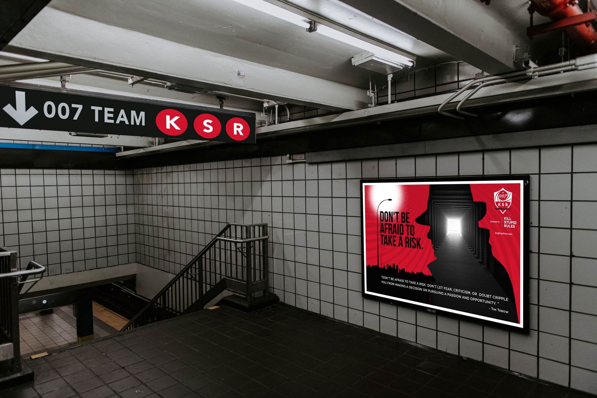
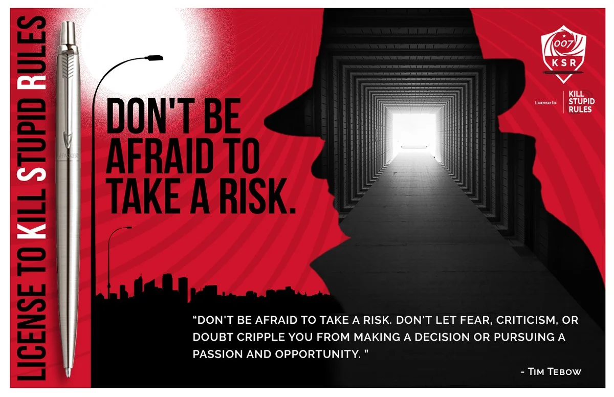
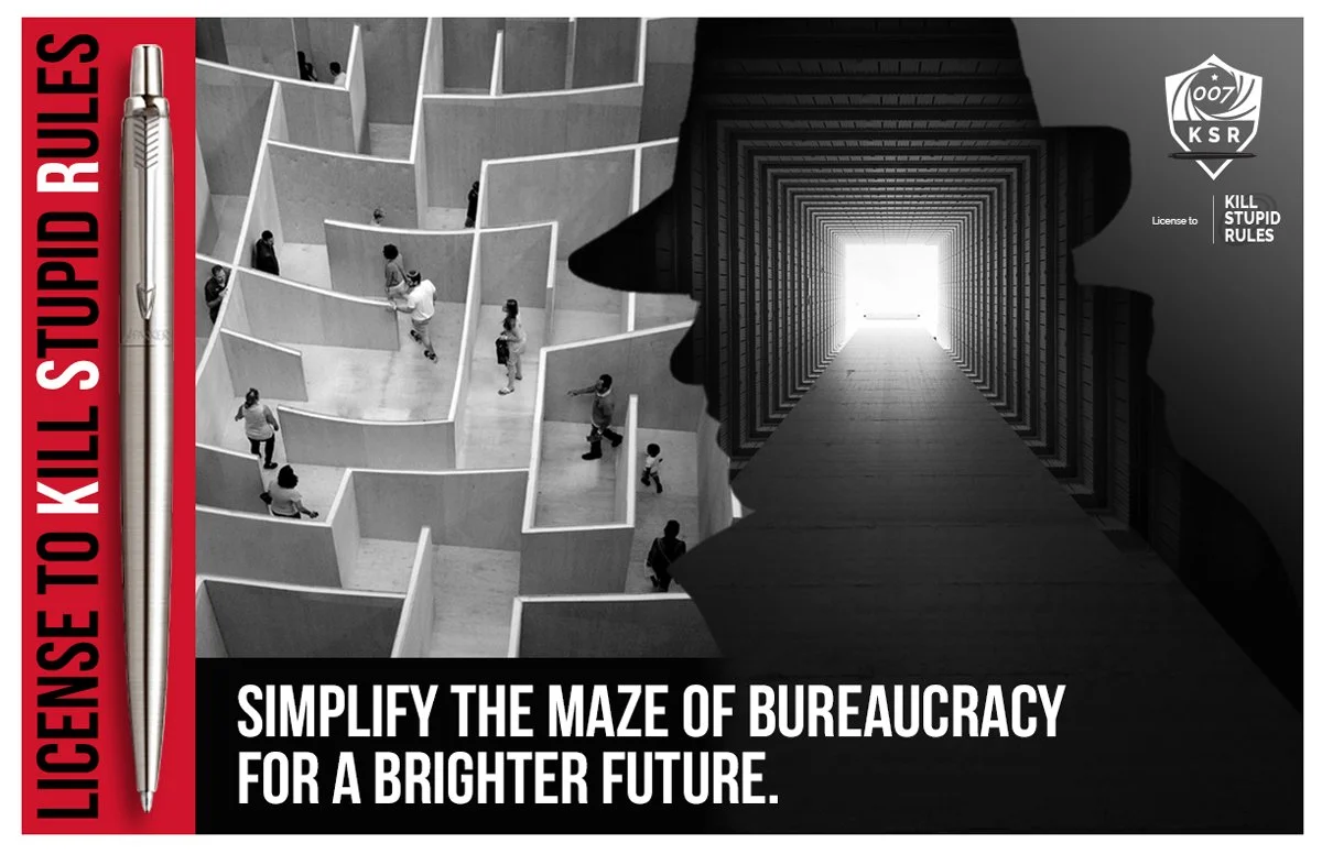
The imaginary suggested to support the KSR_Team project/campaign should transmit a suspense atmosphere, with high color contrasts, preferably non colorful ones and using the color palette suggested. Will be valid to convert an image to grayscale and use the designated red (#CF132C) to bring emphasis and contrast.

007 Agent Manual
The 007 Agent Manual. How to Kill Stupid Rules, is in progress.
The digital version of this amazing manual will be available for the intrepid. You will learn about what to do when a possible rule is making some noise.


